A short post to announce that the Art Setouchi official website has just been redesigned in preparation of the Setouchi Triennale 2013.
There are some good things and less good things in it.
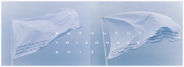
Let’s start with the thing that I find the most surprising: the official poster!
I had a glimpse of it a couple of months ago and I was really hoping for it to be a temporary thing. Apparently not. It’s now the header of the website and it has started to be seen here and there in town, starting with Takamatsu Airport. Here it is:
What do you think?
Personally, I’m less than convinced and I still hope for a concept around it such as variations (with more colors and something, anything, on those flags) from island to island or something along those lines.
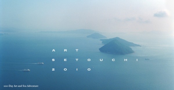
as a reminder, if you want to compare with the poster of the 2010 edition, this is what it looked like:
Much better, isn’t it?
Another issue, a technical one, I have with the site is that it is very slow. I hope they will fix this soon.
Finally, let’s end with the good news. There is a new amazing feature that will make the site as useful as mine when you visit the area. 
In any case, if you haven’t done so yet, put Art Setouchi Official Site in your bookmarks.

